Designing a wearable for clinical research
Designing a wearable for clinical research
Earlier this year, we described the unique opportunities and challenges Verily encounters when delivering successful user experiences (UX) at the intersection of healthcare and high-tech. This second post in our UX series focuses on the ambitious task of designing a wearable that could be used for clinical research to capture health related data, such as electrocardiogram, electrodermal activity, and inertial movements.
The Verily Study Watch was born out of a cross-functional team of engineers, clinicians, and designers thinking about how best to unobtrusively capture health related data. During the initial concept development phase, the team collectively considered different form factors, looking to ideas that were familiar to most people and, of course, easy to use. A watch stood out as a natural fit, and after looking at the technical and user experience-related considerations described below, the plan to build the Study Watch was cemented.
During the development phase, we focused on our primary goal of collecting high integrity clinical data, but we were keenly aware of one very practical consideration—we knew that the watch would only be successful if people wanted to continually wear it. This made UX a necessary part of the core team for building the watch from the ground up. As UX professionals, we identified what a user would need, which was a watch that is simple to use, easy to maintain, and pleasing to wear. To get there, we followed an important principle for our team: fast and frequent user testing and iteration.
Pleasing to wear
Our first foray into designing a watch for clinical studies was to develop an internal device that was an early precursor to the Verily Study Watch. To gather information and requirements for the next generation of the watch, we ran a study where family and friends of Verily employees used the prototype for several weeks and provided feedback through user interviews and surveys.
We learned that personal style was very important in a watch form factor, and a mismatch in this regard was a barrier to using the device. This was no longer just a “sensor”—using a watch as a form factor meant that we were also creating an accessory. As a result, we wanted the watch to have a look that would be appropriate for research participants of various ages and styles. Our solution was to design the watch itself to be classic and gender neutral, but also to provide colorful, interchangeable strap options that were crafted to fit a range of wrist sizes for increased comfort.
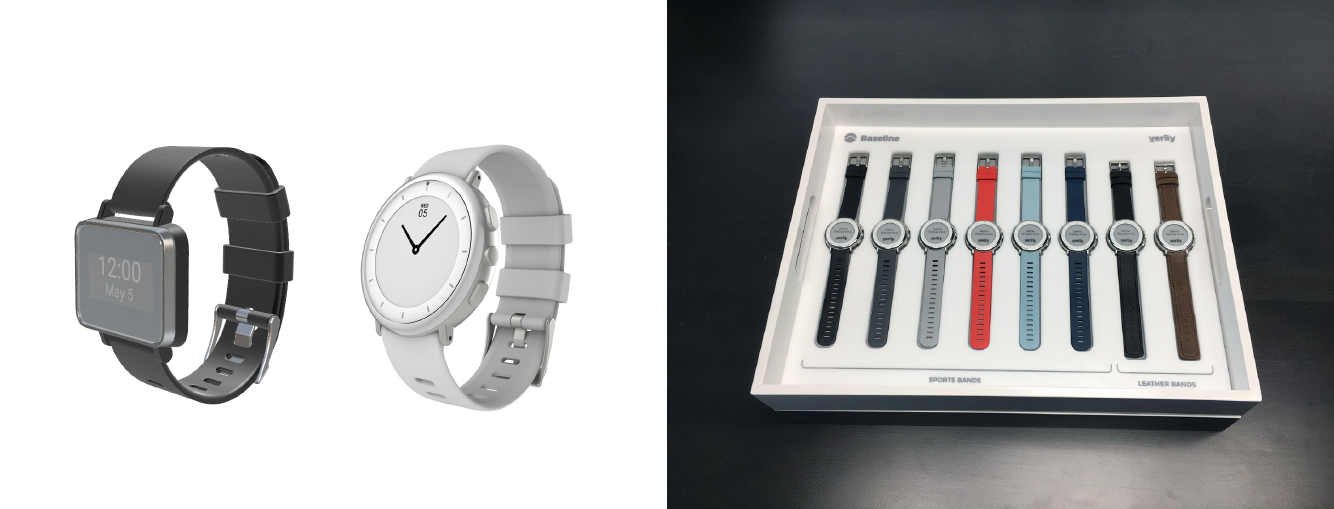
Original (left) and redesigned Study Watch prototypes (right); interchangeable strap options. Note: The Study Watch is an investigational device and is not available for sale.
Easy to maintain
Based on user studies, we knew that charging a device is a burden for our users and frequent charging increases attrition, making long battery life essential. While color touchscreens are ubiquitous among smartwatches, we chose an E Ink screen for our watch because of its sharp contrast, “always on” display and battery life of one week.
In addition to charging, the other burden we tried to alleviate was syncing. We didn’t want to require users to do any complicated set up to establish a wireless connection or to connect to a computer to send us their biosensor data. Instead, we created a connectivity device called Study Hub that automatically encrypts and uploads the data to the cloud when the user charges the watch.
Simple to use
We knew that clinical studies would frequently have populations of users such as older users and users who could be suffering from a variety of conditions including cardiac disease, motion disorders, or trauma. To address the needs of these individuals, we researched their conditions and invited them to Verily to participate in user testing sessions.
These studies taught us that a number of our older users had trouble with touchscreens. Some were simply not familiar with them, but others had very dry skin which reduces the responsiveness of the screen. Another downside to a touchscreen is that touch targets can be small, making them a challenge for users with motion disorders, such as Parkinson’s disease. To address these issues, we decided to use buttons rather than a touchscreen to navigate the user interface (UI).
The limitations of a black and white E Ink screen and a 3-button interface proved to be a great design challenge, which forced us to keep the design of the UI simple and consistent. Throughout the development process, the UX team worked with the Verily firmware team to implement our UI concepts on the watch so that user testing could be as realistic as possible.
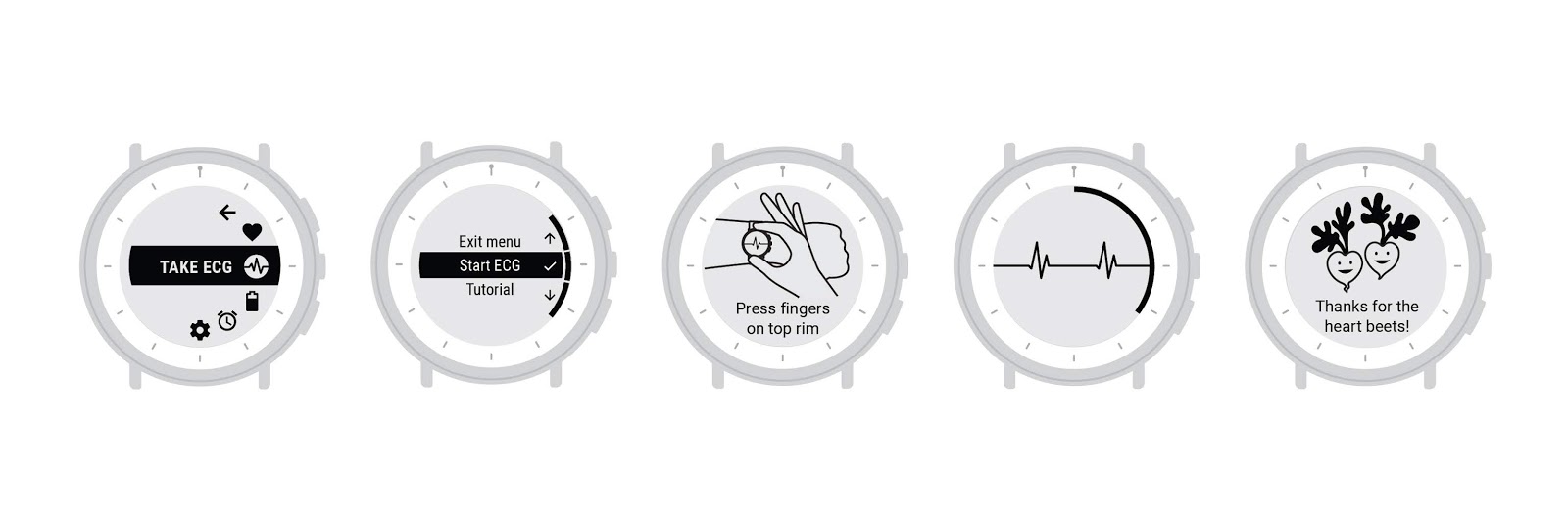
The UI flow for taking an ECG on Study Watch
The Study Watch is already deployed in several clinical studies that span from post-traumatic stress to movement disorders like Parkinson’s disease to the Project Baseline Health Study, and we are continuously seeking user feedback to improve the user experience even further.
We know that in order to achieve our mission of impacting global health, our solutions must be not only technically strong, but also intuitive to use and easily integrated into the users' daily lives. We on the UX team strive to make the experience of using Verily products as seamless and enjoyable as possible.
Posted by Anne Aula, User Experience Lead, Verily, and Shannon Fong, Industrial Designer, Verily